2023-02-01
Let's write a blog in Rust - Part 3
This is just a rewrite of the last post but with Tauri ...
Rust • Tauri • Typescript • SvelteKit
Preface
As the subtitle of this post may imply, I am once again going on a tangent here from my main goal. In the last post I built an Markdown -> HTML converter with Egui, but I wasn’t happy with just seeing the raw HTML, I wanted to see the rendered HTML as if it was on my blog. Of course I’m sure there is a way to hack around this as Egui has web native capabilities, but I took this chance to take a look into Tauri.
As per the Tauri website, Tauri allows you to “Build an optimized, secure, and frontend-independent application for multi-platofmr deployment”, nice. For those familiar with Electron (which is being used as I’m writing this as it was used to build VS Code - ERRATA, I switched to NeoVim for, uh, reasons?), it’s very similar except using a lightweight Rust backend instead of Node.
Now the one major blocker for me beginning to learn Tauri, was simply that I don’t know any frontend framework and barely written any frontend code … so where to begin.
SvelteKit
On the Tauri quick start guides, the following options are given for starting a project:
- Vanilla Javascript
- Next.js
- SvelteKit
- Vite
- Integrate into Existing Project
The one that caught my eye, as I’ve seen it consistently rank as one of the most favoured front-end frameworks is SvelteKit, so I thought I’d see what all the hype is about.
I’m using yarn here, and the simplest way to get going with a Tauri app with yarn is through the create-tauri-app utility which gives you various options for setting up and scaffolding your project. I’ve opted to use Typescript here.
yarn create tauri-app

### Options
# Project Name - Markdown Converter
# Package Name - markdown-converter
# Pacakge Manager - yarn
# UI Template - sveltekit-ts

cd Markdown Converter
# Note - I had some errors about the distDir being set to ../build which did not exist.
# So you may want to add a "mkdir build" here.
yarn
yarn tauri dev
Once the build has completed, you’ll be greeted with the an application which has a couple of links to Vite, Tauri, and Svelte, as well as a text input to enter a name and have the name be “greeted from Rust”:
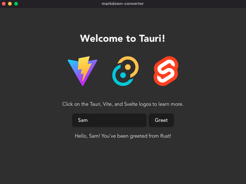
Okay but how? What’s actually happening. Looking at the structure of the root directory, the following tree is laid out:
.
├── README.md
├── build # As above, this was added manually.
├── node_modules
├── package.json
├── src
├── src-tauri
├── static
├── svelte.config.js
├── tsconfig.json
├── vite.config.js
└── yarn.lock
Comparing this to a SvelteKit project, the only difference is the src-tauri directory. Good to know. I’d like to start from a skeleton project and as such so will go through and delete some stuff that isn’t relevant here, this being:
- All static files except for favicon.png
- Greet.svelte (./src/lib/Greet.svelte)
- +layout.svelte (./src/routes/+layout.svelte)
- +layout.ts (./src/routes/+layout.ts)
- Replacing all code in +page.svelte (./src/routes/+page.svelte) with
<h1>Hello World</h1> - Deleting the greet function in main.rs (./src-tauri/src/main.rs) as well as the line
.invoke_handler(tauri::generate_handler![greet])in the main function.
Perfect, we’re left with a skeleton:
So the HTML that is actually being rendered here is within our +page.svelte file within the ./source/routes directory, which is the home/landing page for a SvelteKit application. Reading the routing documentation for SvelteKit, we see that SvelteKit uses a filesystem-based router, such that src/routes is the root route at /, src/routes/about creates an /about route, and so on. The +page.svelte component defines the page of application, so any changes we make here will be reflected in our application.
Tauri handily loads the page of whatever the current URL is. Although right now the idea of this project is just to create a markdown converter, I’m going to create a navbar component so that I can easily extend the application for other things in the future, turning it into my personal development toolbox as such.
Svelte Components and Layout
Svelte components are typically created in their own files so that they can be imported into others. Let’s start by making a Navbar.svelte component. But beforehand, as we’re using Pico CSS, let’s add the file and link it. Okay how do we do that.
First of all let’s talk about how Svelte components even work. In each component, you have a <script> tag, your HTML, and a <style> tag, which applies the CSS within it solely to that component. An example component might look like:
// Button.svelte
<script>
    const onclick_handler = () => {
        console.log("hi");
    }
</script>

<button on:click={onclick_handler}>
    Click Me
</button>

<style>
    button {
        color:blue
    }
</style>
This component runs the onclick_handler arrow function when the button is clicked, and has a blue colour (yes coloUr, I’ll only write the American version when it’s necessary) applied to it.
The important thing here is that the CSS will only apply to this component, and nothing else. The way the Svelte compiler does this is by adding a class to the affected elements based on a hash of the component styles, cool right? In order to apply global styles, we can refer the the special +layout.svelte file, which creats a layout to be applied to every page, so let’s try it out.
First of all let’s create a second page:
// ./src/routes/project2/+page.svelte
<p>Project 2</p>
<a href="/">Home</a>
Then our +layout.svelte. The slot tag means that the content of a page will go into that slot within the main element. I’ve added some styling so that there is some default margin applied on all pages and a max width.
// ./src/routes/`+layout.svelte`
<h1>This is applied to all pages</h1>
<main>
    <slot></slot>
</main>

<style>
    main {
        max-width: 80%;
        margin: 80px auto;
    }
</style>
And in our home page let’s add a link to navigate to the project 2 page:
// ./src/routes/+page.svelte
<p>Home</p>
<a href="project2">Project 2</a>
And then we can see that our svelte layout is indeed applied to all pages:
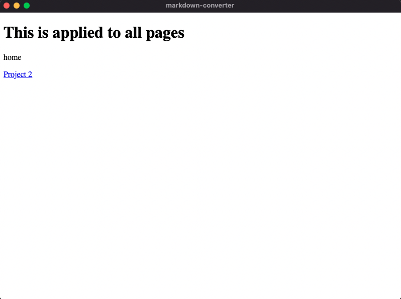
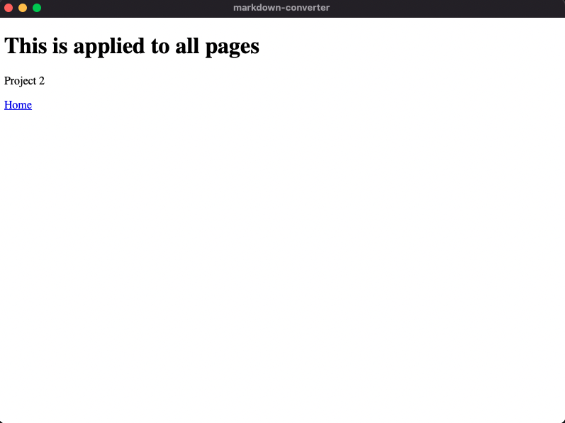
Perfect! Now we can use a similar idea to apply css to all of our pages with the +layout.svelte page.
There is a special <svelte:head> tag which allows us to insert elements inside the <head> of our document, which is where we need to add our CSS file. So adding the following lines to our root +layout.svelte file applies Pico CSS to all of our routes (with our pico.css file residing in our ./static directory):
<svelte:head>
  <link rel="stylesheet" href="/pico.css">
</svelte:head>
Now with Pico css up and running, we can follow their idea for a Navbar component, and then import that into our layout so it is on all our pages! I should note here that with a file-based routing system I found quickly that when I was importing components, you’re often writing annoying paths involving lots of ../../../../../../, but there is a nice preset option in the ts.config file which allows us to access ./src/lib through $lib.
So with that in mind, let’s build our Navbar!
// ./src/lib/Navbar.svelte

<nav>
    <ul>
        <li>
            <a href="/">Home</a>
        </li>
        <li>
            <a href="/project2">Project 2</a>
        </li>
    </ul>
</nav>

<style>
    nav {
        background-color: rgba(0, 0, 0, 1.0);
        padding-left: 20px;
        position: fixed;
        top:0;
        width: 100%;
        overflow:hidden;
    }

    li {
        padding:7px
    }
</style>
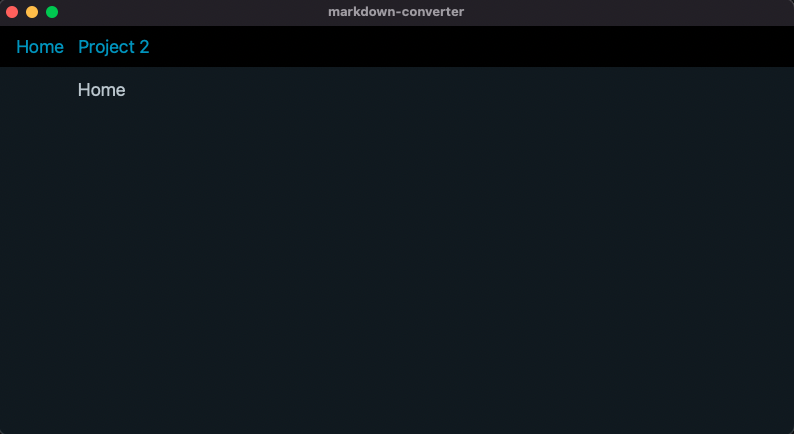
Then we have a much nicer looking UI and can switch between our pages through the Navbar:
One thing I’d like to add here, which also helps to give us an idea of handling state in SvelteKit is a dark mode toggle. Even though I tend towards dark mode as a default and this is a personal tool, might as well do it. Pico CSS has a light mode built in, all we need to do is change the data-theme property in the root <html> element to “light” instead of “dark”.
Within our script tag let’s set it up with some vanilla JS:
<script>
    let theme = "🌅"

    const change_theme = () => {
        let root = document.documentElement;
        if (root.getAttribute("data-theme") === "dark") {
            root.setAttribute("data-theme", "light");
            theme = "🌇";
        } else {
            root.setAttribute("data-theme", "dark");
            theme = "🌅";
        }
}
</script>

<nav>
    <ul>
        <li>
            <a href="/">Home</a>
        </li>
        <li>
            <a href="/project2">Project 2</a>
        </li>
    </ul>

    // Button added here
    <ul>
        <li><button on:click={change_theme}>{theme}</button> </li>
    </ul>
</nav>

<style>
    nav {
        background-color: rgba(0, 0, 0, 1.0);
        padding-left: 20px;
        position: fixed;
        top:0;
        width: 100%;
        overflow:hidden;
    }

    li {
        padding:7px
    }

    button {
        background-color: inherit;
        border:none;
        padding-right: 30px;
        box-shadow: none;
    }
</style>
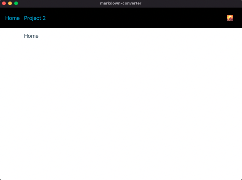
What’s actually going on here is we’re keeping state within our variable theme which has a default value of a sunrise emoji. The arrow function change_theme is then set to grab the root HTML element, and if the data-theme property is dark, then we set it to light and overwrite the theme, and vice versa. This variable is then injected into the button.
From my limited exposure to using React, keeping track of state in Svelte and SvelteKit seems monumentally more natural.
We can then see that when we click the button, we switch to a light theme:
With our setup all done, it’s time to actually build the markdown converter into our Tauri application.
Calling Rust Functions
So how do we call Rust functions from our SvelteKit frontend? As stated in the docs, “Tauri provides a simple yet powerful command system for calling Rust functions from your web app”.
They give a nice example which we’ll test out quickly. In main.rs we write our function and add the #[tauri::command] macro to it, then explicitly telling the Tauri builder that is a command that we wish to invoke from the frontend in the main function:
#[tauri::command]
fn my_custom_command() {
  println!("I'm a Rust function invoked from the SvelteKit frontend!");
}

fn main() {
  tauri::Builder::default()
    // This is where you pass in your commands
    .invoke_handler(tauri::generate_handler![my_custom_command])
    .run(tauri::generate_context!())
    .expect("failed to run app");
}
Then within our component script we import the invoke Tauri invoke function and then we can write an arrow function to wrap our function that we have just written:
<script lang=ts>
    import { invoke } from '@tauri-apps/api/tauri';

   const print_hello = () => {
     invoke("my_custom_command");
   }
</script>

<button on:click={print_hello}>Invoke Tauri Command</button>
Then we can see that on clicking the button, the message is printed in the terminal! Let’s take the function that we wrote in the last post to convert markdown to HTML and run that instead:
#[tauri::command]
fn convert_markdown_to_html(markdown:&str) -> String {
  let parser = Parser::new_ext(markdown, Options::empty());
  let mut html_output = String::new();
  html::push_html(&mut html_output, parser);
  html_output
}
And then in our page, we’ll set up two text areas, the first for the markdown input, the second for the html output, and have this function run on input:
<script lang=ts>
  import { invoke } from '@tauri-apps/api/tauri';

  let markdown = "";
  let html = "";

  async function convert() {
      html = await invoke('convert_markdown_to_html', { markdown });
  }

</script>


<div class=grid>
  <div>
    <textarea rows=10 bind:value={markdown} on:input={convert}></textarea>
  </div>
  <div>
    <textarea bind:value={html}></textarea>
  </div>
</div>

<style>

  .grid {
    height: 100%;
  }

  textarea {
    height:90%;
    width:90%;
    resize: none;
    box-shadow: none;
    transition: none;
  }

</style>
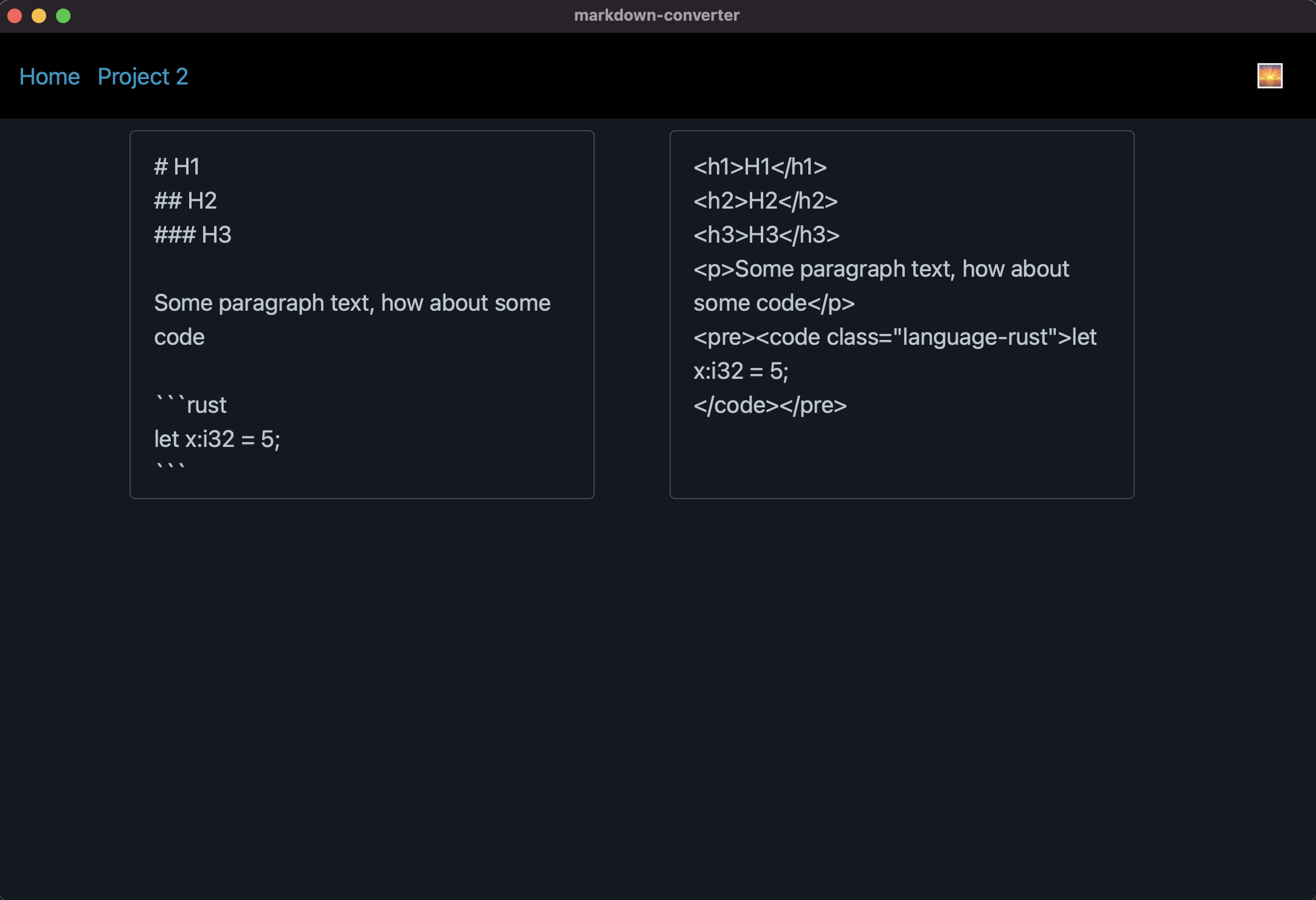
Et voila! The converter is working as intended:
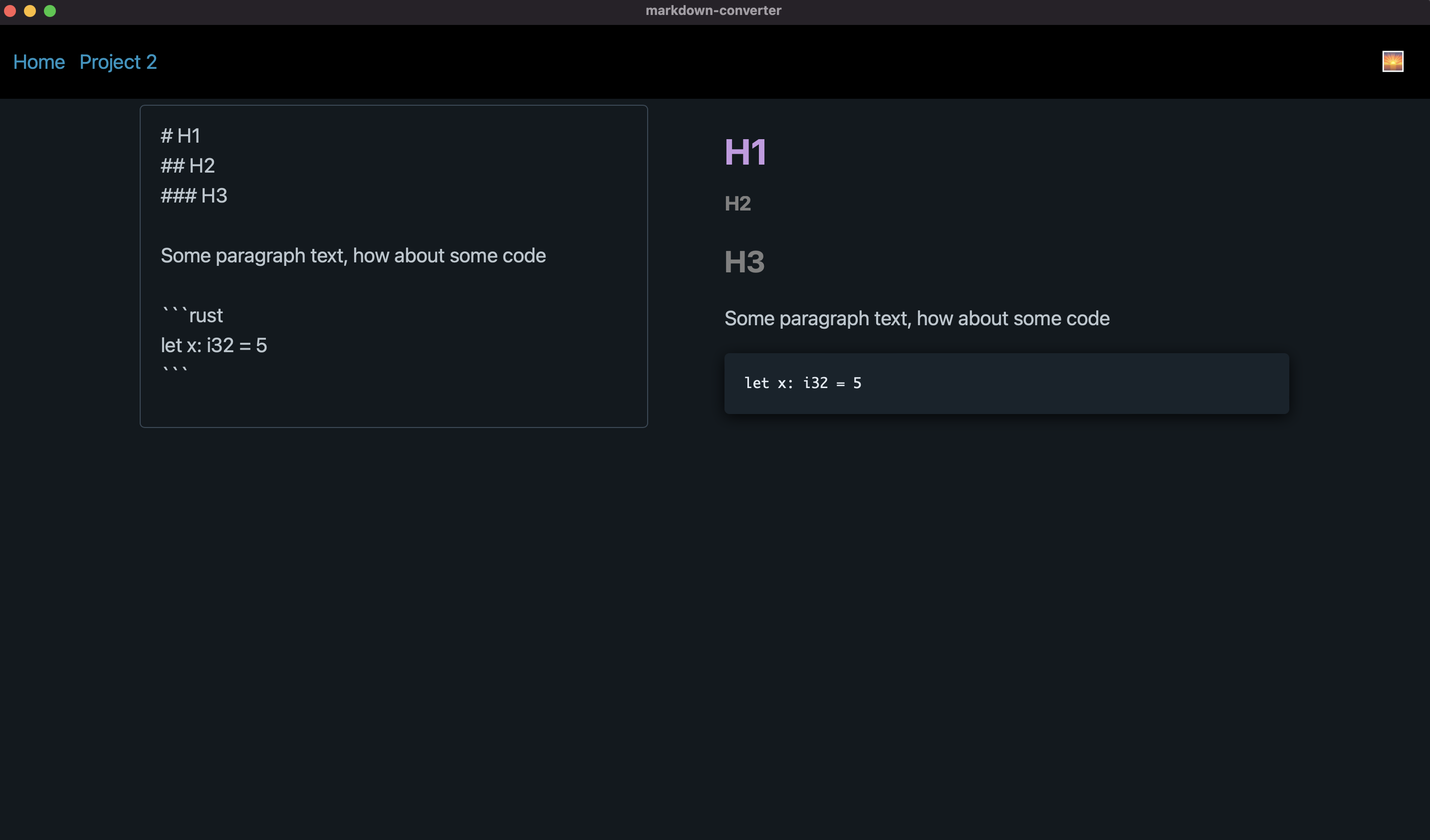
And for the final touch, the very reason I started this project with Tauri in the first place, I’d like to actually render the HTML as if it was on my blog, and as we have our HTML value which is a string of HTML, we can use the svelte @html tag to do this, such that our HTML content for the page becomes:
<div class=grid>
  <div>
    <textarea rows=10 bind:value={markdown} on:input={convert}></textarea>
  </div>
  <div>
    {@html html}
  </div>
</div>
Let’s take a look:
And it’s done, noice.
I should note that I tried and failed to apply my Prisma code highlighting within this tool due to the way the Rust markdown-converter parses code blocks, I might have to take a look into trying to improve this in future, but for now, I’m content with the tool.
Wrapping Up
This post was a very quick dive into Tauri and SvelteKit, and I’ve gotta say, I’m a BIG fan of SvelteKit, well in particular Svelte. It feels incredibly natural to write, and I’ll definitely be wanting to use it in future. In fact, one of the reasons I love Rust and started this blog was to experiment with Yew, but if I’m honest, building a frontend with SvelteKit feels far more ergonomic…maybe I should just write the blog with SvelteKit instead, especially as it has built a built-in adapter for deploying with Vercel.
Okay I’m convinced, onwards to the next series, “Let’s build a blog with Sveltekit”, but maybe with a brief post on my move to Neovim first.